

Hhaapppyy Sssuunnddaayy!
Also, happy National Day of Prayer! I hope you are all safe and well.
I have been rather scant in posts lately, but I’m a comin’ back. I have been doing lots of letter art and lettering in general, and it crossed my mind that I haven’t done that many lettering posts.


#1 Basic Dropshadow


#2 A Bit More Plump
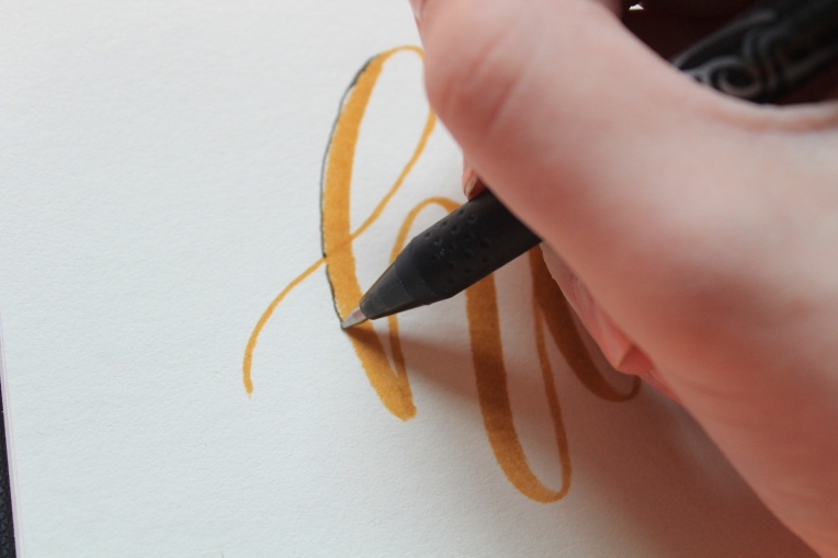
The next one is one I do often.
Instead of a regular pen, I’m using the Tomdow fudenosuke hard tip (My favorite. I use this most every day!) to do the drop shadows. This will create a more thick line without it being too thick.

Start again from the top of the downstroke, and head down, jumping over any line intersections.


TAA DAA!
It’s a bit more of a bold look, I like how it looks like a shadow. This can be done with any tools, too, which is a plus!

#3 A Bit More Fancy
This is what I most use when it comes to drop shadows, I love how the shadows… scroll for more!
I’m back to the Pilot Frixion pen, but you can use anything(:

Start by doing the same thing as the other two, draw the drop shadows along the edge of the downstrokes.

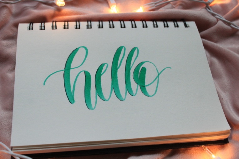
Once you’ve done that, go back to the first letter and start your line on the top of the entering line.
Continue that line over where you intersected the lines and up into the loop. Don’t go all the way around, your new line should stop under where the other one started.


Start again on top of the next line. End mid-arch, never overlapping your first set of drop shadows.

Next to the loop going into E the same way. Also to the loop on e. Continue this way until you’ve reached the end.


Yay! This is my favorite way to do drop shadows. It’s so fun and easy!

#4 A Shade Lighter Than The Rest
This is a subtle and fun way to add dimension to your lettering, and it’s easy and fun, too!
Pick a color, any color, then find a lighter one, probably 60% lighter. If you do black, find a light grey. Navy, find light blue. I did blush pink/mauve, so I found a faint/baby pink.
Here are the two most used backdrop colors I use, 800 (baby pink) and N89 (warm grey) (also 873 (coral), but I didn’t snap a photo)

Take the brush side (or however you can make a thick stroke on the pen you use) and do the same as the first two, start at the top of the downstroke and go down.


Done! It’s a subtle way to add depth and dimension, and the outcome is really pretty!
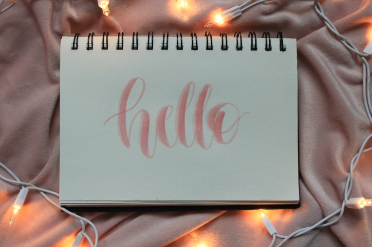
As a little bonus onto this style, you can take a black pen (I’m using the Frixion one again) and line the downstrokes close to the original letter.


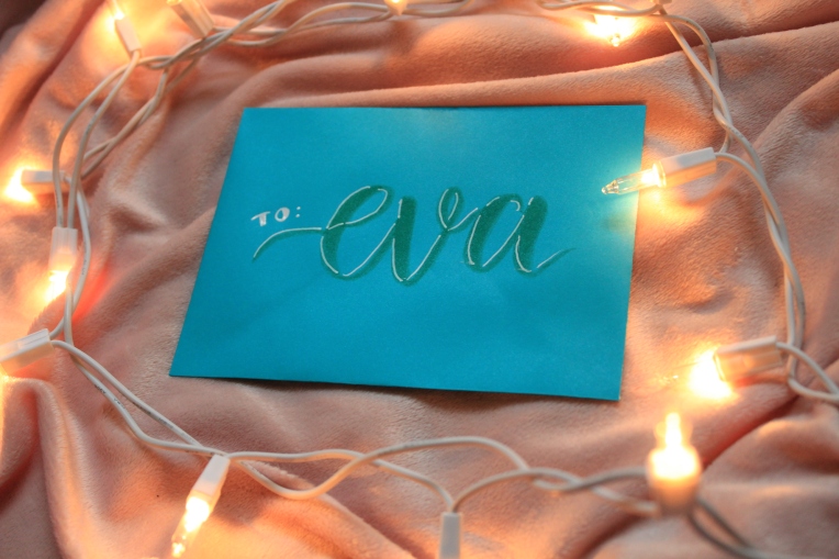
#5 A Different Hue
I picked a envelope with a medium color, turquoise, and I wrote in an equal tone.

Instead of black or pink or grey, grab a white, silver or gold. I’m using my white Uni-ball Signo broad gel pen. (Ammaazziinngg)

Start like before, starting at the top of the downstroke and going down.
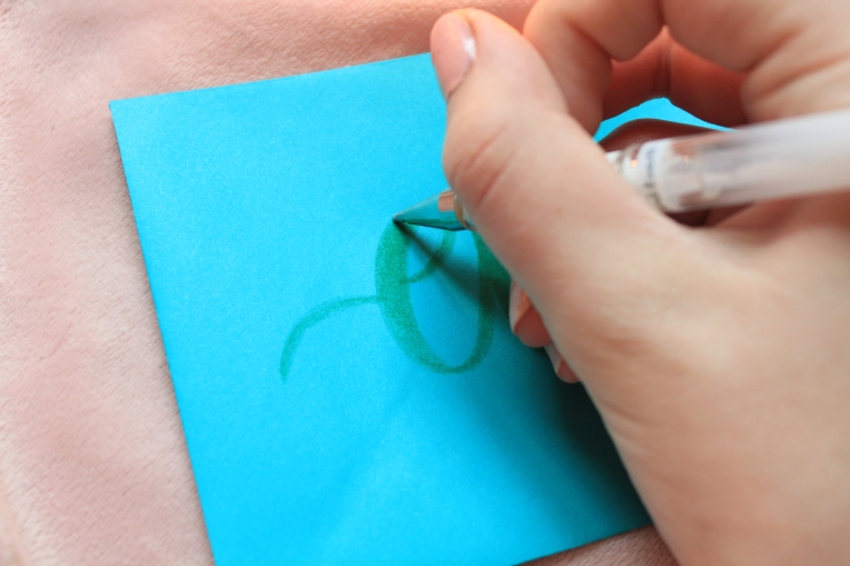


Then, like #3, line the inside of the upstrokes.


I love how this creates more of a highlighted look than a shadow. It’s so pretty on toned paper such as this.
I hope you all enjoyed this little tutorial! Let me know what you thought!
Have a happy Sunday!

Which was your favorite, #1, #2, #3, #4, #5? Do you like tutorials like these? Want more lettering posts, or something else (what else?)? Do you like bradford pear trees? Snails or worms? XD


Ahh, so pretty AK! I really need to work on improving my hand lettering skills. XD 😛
LikeLiked by 1 person
Thank you!
LikeLiked by 1 person
Fun tutorial, AK!! Drop shadows look super easy! I’m going to have to try experimenting and look into investing in those pens. 😀 I think it would be fun if you did more tutorial posts and lettering posts. That would be awesome!
LikeLiked by 1 person
Thank you! Yes, they are! Ooh, you should, they’re some of my favorite ones. Okay, great! Thanks for letting me know(:
LikeLiked by 1 person
Yesssss!!! More hand lettering posts!!! You’re pictures are sooo pretty!😊 I also do hand lettering, and loove the Tombow Dual tips and fudenosuke brush pens! I always love learning new techniques!❤ And definitely snails over worms, although I don’t find worms that gross!😛
LikeLiked by 1 person
^*Your not you’re (sorry!)
LikeLiked by 1 person
Okay! Thank you for letting me know, Abigail! (:
Thank you, thank you! Aren’t they awesome pens? My favorites. Haha, me too! Thank you for the lovely comment(:
LikeLike
Eeep! That hand lettering is so so pretty! I love all of them! 😛 Yes! Iove these kind of posts! 😀 What are bradford pear trees? XD Snails! 😀 XD Wonderfuly-awesome post! 😀
-Laura ❤ 🙂
LikeLiked by 1 person
Thank you, Laura! Bradford pears are those trees with the white flowers. they’re blooming like crazy here!
Thank you!
LikeLiked by 1 person
Oh cool! 😀 You’re very welcome! ❤
LikeLiked by 1 person
Love this!! ❤ ❤
LikeLiked by 1 person
Thank you!
LikeLiked by 1 person
🙂
LikeLiked by 1 person
Ahhhhh….these are sooooooo pretty! I love them all, but especially #4!
LikeLiked by 1 person
Thank you!!
LikeLiked by 1 person